Custom Renderer
With the custom renderer it is possible to visualise external data based on an HTML template. A custom version of the Bootstrap framework is included to easily build basic HTML templates.
Important
We strongly advise using the Cards module for all new configurations. The Cards module is the preferred, future-proof alternative to Custom Renderers.
Configuration Script
Every read view can be easily transformed into a beautiful HTML template by specifying the template in the configuration script of the view. The concept is always as follows:
/**
 * Declare a function in a new variable. This function needs to return the HTML as a string.
 * Optional - Pass in three arguments: rowData, formattedData and csl.
 * rowData gives you access to the current row. All values are invariant and in string format.
 * formattedData gives you access to the current row. All values are formatted as configured in the view formatter.
 * csl gives you access to the entire CSL library.
 */
const templateFunction = function (rowData, formattedData, csl) {
  /**
   * You get access to the current row via the rowData argument.
   * Remember to parse numbers and dates if you want to make calculations.
   */
  let productName = rowData.productName;
  let productPrice = parseFloat(rowData.productPrice);
  let date = new Date(rowData["delivery date"]);

  /**
   * Return the template. Use the backticks to make use of string interpolation if you want to include context from the current row.
   */
  return `
    <div class="card">
        ${productName}
    </div>
    `;
};

/**
 * Use the setCustomTemplate function from the CSL. You can the following six arguments:
 * templateFunction: this is the function declared above.
 * containerClass: optional, css classes which are applied on the container only once.
 * elementClass: optional, css classes which are applied on each element in the loop.
 * emptyTemplateFunction: optional, this is the function which will be executed when there are no rows.
 * customTemplateProperties: optional, extra properties.
 * componentId: optional, which component to set the template on.
 */
CSL.view.setCustomTemplate(
  templateFunction,
  "obiz-flex obiz-flex-row obiz-flex-wrap",
  "col-sm-6 col-lg-4",
);
Content Security Policy
With the introduction of the Content Security Policy (CSP), inline scripting is no longer allowed. However, no changes are required for scripts used in the Custom Renderer. At runtime, the Custom Renderer automatically converts inline event handlers into event listeners.
For more details, refer to Content Security Policy article.
Custom Renderer HTML Structure
The default HTML structure of the custom renderer is a follows:
<div class="containerClass">
    <span class="elementClass">
        <your-template></your-template>
    <span>
</div>
For every record returned a new span will be rendered. If the method returns three records you will get the following:
<div class="containerClass">
    <span class="elementClass">
        <your-template></your-template>
    <span>
    <span class="elementClass">
        <your-template></your-template>
    <span>
    <span class="elementClass">
        <your-template></your-template>
    <span>
</div>
By specifying the containerClass and/or elementClass you can make the template responsive by using the grid system of Bootstrap. You probably only use this when your method returns more than one row.
Multiple Records at Once
Note
This has only effect on multi record views. Single record view ignores this option.
It is also possible to configure multipleRecordsAtOnce. When this parameter is set to true, your template won't be repeated for the number of records returned by the method. The template will be executed only once and the first two arguments of the template function will be arrays instead of objects.
/**
 * Declare a function in a new variable. This function needs to return the HTML as a string.
 * Optional - Pass in three arguments: records, formattedRecords and csl.
 * rows gives you access to all rows. All values are invariant and in string format.
 * formattedRows gives you access to all rows. All values are formatted as configured in the view formatter.
 * csl gives you access to the entire CSL library.
 */
let templateFunction = function (rows, formattedRows, csl) {
  rows.forEach((row) => {
    // You have access to the each row ...
  });

  return `Some kind of HTML template`;
};

/**
 * Use the setCustomTemplate function from the CSL. You can the following five arguments:
 * templateFunction: this is the function declared above.
 * containerClass: optional, css classes which are applied on the container only once.
 * elementClass: optional, css classes which are applied on each element in the loop.
 * emptyTemplateFunction: optional, this is the function which will be executed when there are no rows.
 * customTemplateProperties: optional, extra properties.
 */
CSL.view.setCustomTemplate(templateFunction, null, null, null, {
  multipleRecordsAtOnce: true,
});
No Result Message
When there are no results, the default behaviour is that the no results message is displayed from the view. However, it is possible to specify a custom template for this.
const templateFunction = () => `<div>My Custom Record Template</div>`;

// This is the function executed when there is no data.
const emptyTemplateFunction = () => `<p>Sorry there is no data.</p>`;

// Pass the emptyTemplateFunction as fourth argument.
CSL.view.setCustomTemplate(templateFunction, "", "", emptyTemplateFunction);
Defining Functions
Sometimes you want to include event listeners such as click handlers. The only way to support this is to create functions on the global window object. The advise here is to create your own namespace to minimize the risk of conflicts.
Note
The CSP function makeElementsCspCompliant is not required in this case. The Custom Renderer automatically converts the code to be CSP-compliant at runtime.
// Code to make sure your namespace is not overwritten by other components on the page using the same namespace.
window.myNamespace =
  typeof window.myNamespace === "undefined" ? {} : window.myNamespace;

// Declare a function inside your namespace.
window.myNamespace.processAction = function (htmlElement) {
  // Do something ...
  // If you pass `this` as argument in the onclick function, you get access to the current HTML element.
};

// Use the function somewhere in the template.
return `
    <div class="card" onclick="window.myNamespace.processAction(this)">
    </div>
`;
Warning
When using an a-tag to open a dialog, the href cannot be '#' because this will trigger a refresh and the dialog will be destroyed. Remove the href attribute or use 'javascript:void(0)' instead.
Use the following code:
<a href="javascript:void(0)" class="btn btn-secondary btn-sm" onclick="window.myNamespace.processAction(this)">Action</a>
<a class="btn btn-secondary btn-sm" onclick="window.myNamespace.processAction(this)">Action</a>
Instead of:
<a href="#" class="btn btn-secondary btn-sm" onclick="window.myNamespace.processAction(this)">Action</a>
Bootstrap Light
A custom version of Bootstrap 4.4.1 is loaded into the application to ensure some basic functionality. The following is included:
Default Card
The following is one of the most basic cards there is. The card contains of a title, subtitle and text.
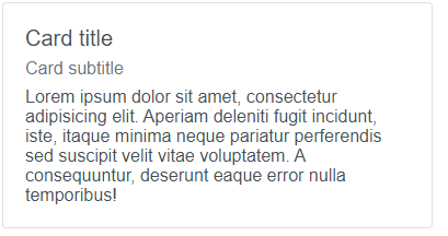
const templateFunction = function (rowData, formattedData, csl) {
  let title = rowData["title"];
  let subTitle = rowData["subTitle"];
  let body = rowData["body"];

  return `
    <div class="card">
        <div class="card-body">
            <h5 class="card-title">${title}</h5>
            <h6 class="card-subtitle mb-2 text-muted">${subTitle}</h6>
            <p class="card-text">
                ${body}
            </p>
        </div>
    </div>
    `;
};

CSL.view.setCustomTemplate(
  templateFunction,
  "obiz-flex obiz-flex-row obiz-flex-wrap",
  "obiz-col-sm-6 obiz-col-lg-4",
);
Action Card
The following is a more advanced type of card displaying a card with a header, body and two action buttons.
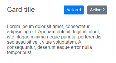
const templateFunction = function (rowData, formattedData, csl) {
  return `
    <div class="card">
        <div class="card-header bg-white">
            <h4 class="obiz-float-left obiz-mb-0">Card title</h4>
            <div class="obiz-float-right">
                <a href="#" class="btn btn-primary btn-sm">Action 1</a>
                <a href="#" class="btn btn-secondary btn-sm ml-2">Action 2</a>
            </div>
        </div>
        <div class="card-body">
            <p class="card-text">
                Lorem ipsum dolor sit amet, consectetur adipisicing elit. Aperiam deleniti fugit incidunt, iste, itaque minima neque pariatur perferendis sed suscipit velit vitae voluptatem. A consequuntur, deserunt eaque error nulla temporibus!
            </p>
        </div>
    </div>
    `;
};

CSL.view.setCustomTemplate(
  templateFunction,
  "obiz-flex obiz-flex-row obiz-flex-wrap",
  "obiz-col-sm-6 obiz-col-lg-4",
);
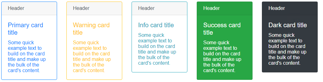
Colour Card
The following cards make use of the border- and bg- classes to emphasize a certain card.
const templateFunction = function () {
  return `
    <div class="row">
        <div class="col-md-6 col-lg-2">
            <div class="card border-primary mb-3" style="max-width: 18rem;">
                <div class="card-header">Header</div>
                <div class="card-body text-primary">
                    <h5 class="card-title">Primary card title</h5>
                    <p class="card-text">Some quick example text to build on the card title and make up the bulk of the card's content.</p>
                </div>
            </div>
        </div>
        <div class="col-md-6 col-lg-2">
            <div class="card border-warning mb-3" style="max-width: 18rem;">
                <div class="card-header">Header</div>
                <div class="card-body text-warning">
                    <h5 class="card-title">Warning card title</h5>
                    <p class="card-text">Some quick example text to build on the card title and make up the bulk of the card's content.</p>
                </div>
            </div>
        </div>
        <div class="col-md-6 col-lg-2">
            <div class="card border-info mb-3" style="max-width: 18rem;">
                <div class="card-header">Header</div>
                <div class="card-body text-info">
                    <h5 class="card-title">Info card title</h5>
                    <p class="card-text">Some quick example text to build on the card title and make up the bulk of the card's content.</p>
                </div>
            </div>
        </div>
        <div class="col-md-6 col-lg-2">
            <div class="card text-white bg-success mb-3" style="max-width: 18rem;">
                <div class="card-header">Header</div>
                <div class="card-body">
                    <h5 class="card-title">Success card title</h5>
                    <p class="card-text">Some quick example text to build on the card title and make up the bulk of the card's content.</p>
                </div>
            </div>
        </div>
        <div class="col-md-6 col-lg-2">
            <div class="card text-white bg-dark mb-3" style="max-width: 18rem;">
                <div class="card-header">Header</div>
                <div class="card-body">
                    <h5 class="card-title">Dark card title</h5>
                    <p class="card-text">Some quick example text to build on the card title and make up the bulk of the card's content.</p>
                </div>
            </div>
        </div>
    </div>
    `;
};

CSL.view.setCustomTemplate(templateFunction);
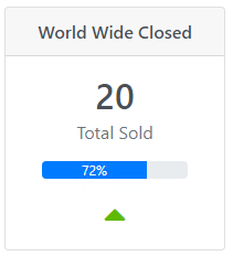
Card with Progress
The following card combines a header and a progress bar. It also has a fixed with of 200 pixels.
const templateFunction = function () {
  return `
    <div class="card text-center" style="width: 200px">
        <h6 class="card-header">World Wide Closed</h6>
        <div class="card-body p-3">
            <div class="h2 mb-1">20</div>
            <div class="text-muted mb-3">Total Sold</div>
            <div class="progress mx-auto mb-3" style="width: 80%">
                <div class="progress-bar" role="progressbar" style="width: 72%;" aria-valuenow="25" aria-valuemin="0" aria-valuemax="100">72%</div>
            </div>
            <i class="fas fa-caret-up fa-2x" style="color: #5eba00;"></i>
        </div>
    </div>
    `;
};

CSL.view.setCustomTemplate(templateFunction);
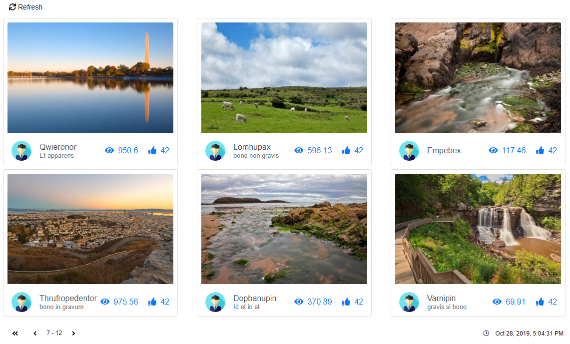
Gallery
The gallery displays multiple cards in the form of image cards. By applying the col-sm-6 col-lg-4 as elementClass the gallery is responsive.
On small devices it displays two next to each other, on large screens there are three cards next to each other.
const templateFunction = function (rowData, csl) {
  let id = rowData["photoId"];
  let name = rowData["name"];
  let description = rowData["description"];
  let views = rowData["views"];
  let likes = rowData["likes"];
  let avatarUrl = rowData["avatar url"];

  /**
   * Navigates to the details page for the landscape.
   */
  navigateToLandscape = function (id) {
    window.location = `myUrl/gallery/${id}`;
  };

  /**
   * Process hitting the like button.
   */
  processLike = function (id) {
    csl.rest.executeMethod("action", "process like");
  };

  return `
    <style>
        .avatar {
            border-radius: 50%;
            background: no-repeat center/cover;
            position: relative;
            display: inline-block;
            width: 2.5rem;
            height: 2.5rem;
            line-height: 2.5rem;
        }
    </style>

    <div class="card m-1 p-2">
        <a href="javascript:navigateToLandscape(${id})" class="mb-3">
            <img src="myUrl/gallery/${id}.jpg" alt="${name}" class="card-img-top">
        </a>
        <div class="d-flex align-items-center px-2">
            <div class="avatar mr-3" style="background-image: url(${avatarUrl})"></div>
            <div>
                <div>${name}</div>
                <small class="d-block text-muted">${description}</small>
            </div>
            <div class="ml-auto text-muted">
                <i class="fas fa-eye mr-1"></i> ${views}
                <a href="javascript:processLike(${id})" class="icon d-none d-md-inline-block ml-3"><i class="fas fa-thumbs-up mr-1"></i> ${likes}</a>
            </div>
        </div>
    </div>
    `;
};

CSL.view.setCustomTemplate(
  templateFunction,
  "obiz-flex obiz-flex-row obiz-flex-wrap",
  "col-sm-6 col-lg-4",
);
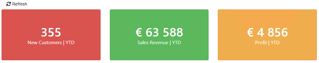
Three Cards with KPI Colours
The following is an example where three cards are displayed. Depending on the value, the cards will have a different background colour.
const templateFunction = function (rowData, formattedData) {
  const newCustomers = parseInt(rowData["New Customers"]);
  const salesRevenue = parseInt(rowData["Sales Revenue"]);
  const profit = parseInt(rowData["Profit"]);

  /**
   * 5000+ = good
   * 500 - 5000 = not so good
   * -500 = terrible
   */
  function processKpi(value) {
    switch (true) {
      case value < 500:
        return "#d9534f";
      case value < 5000:
        return "#f0ad4e";
      case value >= 5000:
        return "#5cb85c";
    }
  }

  return `
    <div class="row row-cards">
        <div class="col-sm-4 col-lg-4">
            <div class="card" style="color:white; background-color:${processKpi(newCustomers)}">
                <div class="card-body p-5 text-center">
                    <div class="h1 m-0">${formattedData["New Customers"]}</div>
                    <div>New Customers | YTD</div>
                </div>
            </div>
        </div>
        <div class="col-sm-4 col-lg-4">
            <div class="card" style="color:white; background-color:${processKpi(salesRevenue)}">
                <div class="card-body p-5 text-center">
                    <div class="h1 m-0">${formattedData["Sales Revenue"]}</div>
                    <div>Sales Revenue | YTD</div>
                </div>
            </div>
        </div>
        <div class="col-sm-4 col-lg-4">
            <div class="card" style="color:white; background-color:${processKpi(profit)}">
                <div class="card-body p-5 text-center">
                    <div class="h1 m-0">${formattedData["Profit"]}</div>
                    <div>Profit | YTD</div>
                </div>
            </div>
        </div>
    </div>
    `;
};

CSL.view.setCustomTemplate(templateFunction);
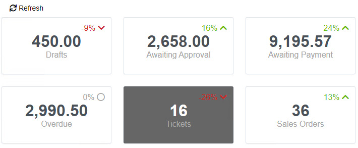
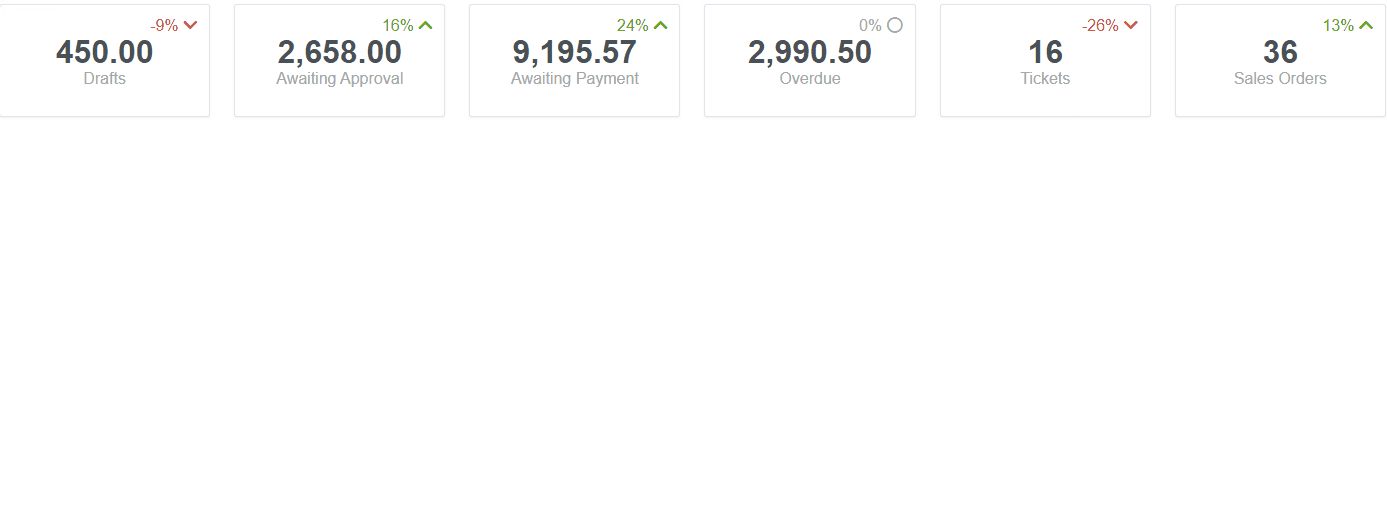
Six Cards with Click Interaction
The following is an example where six cards are displayed. When clicking on a card, it gets active. Only one card can be active.
const templateFunction = function (rowData, formattedData) {
  // Isolate global function in a namespace to minimize the risk of conflicts.
  window.myNamespace =
    typeof window.myNamespace === "undefined" ? {} : window.myNamespace;

  // Tracker for current active card, so it can be removed when another card is clicked.
  window.myNamespace.activeCard = null;

  /**
   * Make sure the clicked card is active.
   */
  window.myNamespace.toggleActive = function (div) {
    // Only one card can be active.
    if (
      window.myNamespace.activeCard !== null &&
      window.myNamespace.activeCard !== div
    ) {
      window.myNamespace.activeCard.style.backgroundColor = "white";
      window.myNamespace.activeCard.style.color = "#495057";
    }

    // rgb(102, 102, 102) means the card is active.
    if (div.style.backgroundColor === "rgb(102, 102, 102)") {
      div.style.backgroundColor = "white";
      div.style.color = "#495057";
      window.myNamespace.activeCard = null;
    } else {
      div.style.backgroundColor = "rgb(102, 102, 102)";
      div.style.color = "white";
      window.myNamespace.activeCard = div;
    }
  };

  /**
   * Returns a new card element.
   */
  function createCard(subTitle, title, percentage) {
    /**
     * Gets the correct icon and apply correct styling based on the percentage.
     */
    function getFaIcon(percentage) {
      if (percentage == 0) {
        return { icon: "far fa-circle", style: "color: #a7a7a7;" };
      }
      if (percentage < 0) {
        return {
          icon: "fas fa-chevron-down",
          style: "color: #cd201f !important;",
        };
      }
      if (percentage > 0) {
        return { icon: "fas fa-chevron-up", style: "#5eba00 !important;" };
      }
    }

    return `
        <div class="col-6 col-sm-4 col-lg-2">
            <div class="card" style="cursor:pointer;" onclick="window.myNamespace.toggleActive(this)">
                <div class="card-body p-3 text-center">
                    <div class="text-right" style="${getFaIcon(percentage).style}">
                      ${percentage}%
                      <i class="${getFaIcon(percentage).icon}"></i>
                    </div>
                    <div class="h3 m-0">${title}</div>
                    <div class="mb-4">${subTitle}</div>
                </div>
            </div>
        </div>`;
  }

  // Here you probably read the `rowData` and loop through the collection.
  let cards = createCard("Drafts", "450.00", -9);
  cards += createCard("Awaiting Approval", "2,658.00", 16);
  cards += createCard("Awaiting Payment", "9,195.57", 24);
  cards += createCard("Overdue", "2,990.50", 0);
  cards += createCard("Tickets", "16", -26);
  cards += createCard("Sales Orders", "36", 13);

  return `
    <div class="row row-cards">
        ${cards}
    </div>
    `;
};

CSL.view.setCustomTemplate(templateFunction);
Navigation Tiles
Large Tiles

Fixed 10 Tiles
List